
React Boolean Prop Variants
After years of using Tailwind CSS, whenever I use CSS Modules or go back to using styled components or basic CSS I’m struck by how wordy they are. Take this block for example:
* {
  display: flex;
  justify-content: flex-end;
  flex-direction: row;
  flex-wrap: wrap;
  visibility: visible;
}
And compare it to Tailwind CSS:
flex justify-end flex-row flex-wrap visible
So many times the value of a CSS property is explicit enough to not even need the property definition. inline, block, inline-block, flex, hidden are all unique to the display property, so why not drop the display keyword all together? That’s exactly what Tailwind CSS does and it’s great!
React Props
This is often the case with React component API design as well. The shadcn/ui button component is a good example of this. A variant prop is used to define the type of button.
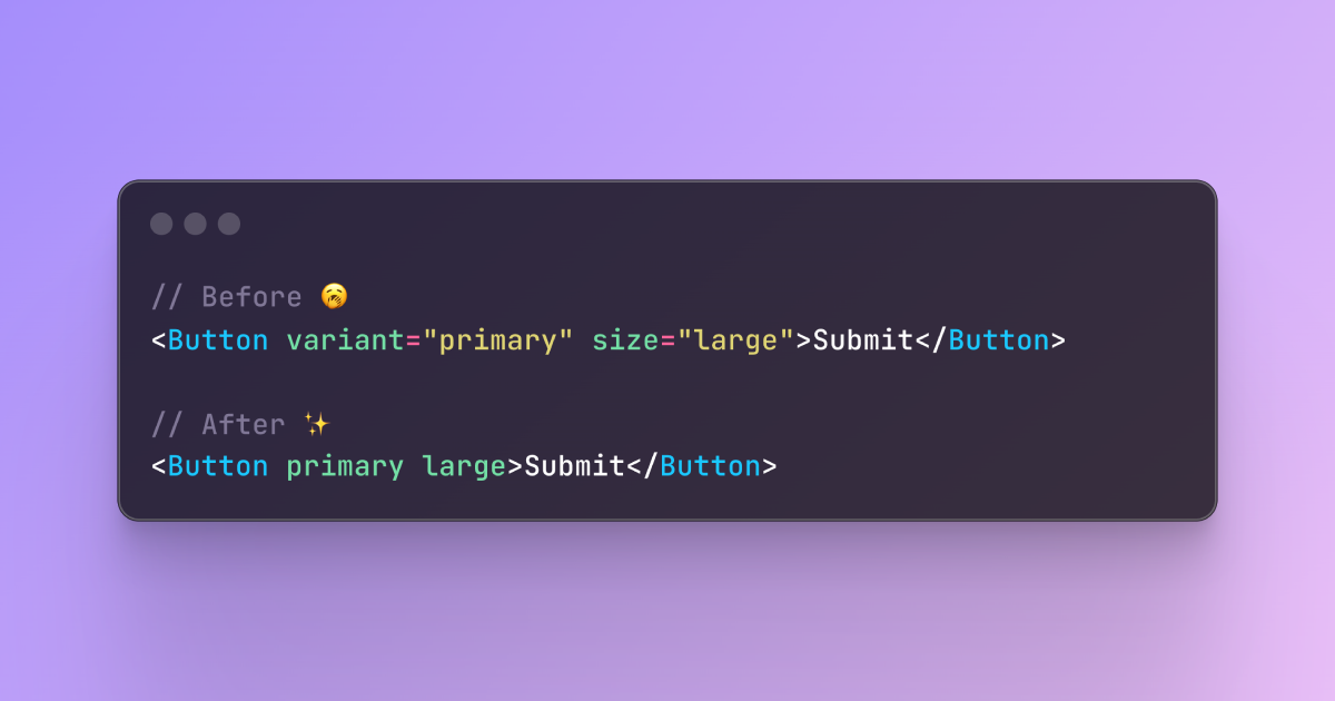
<Button variant="secondary">Secondary</Button>Variant options include default, secondary, destructive, outline, ghost, and link. With maybe the exception of link, these prop values are all unique enough that they could be their own boolean props, simplifying the API down to the bare minimum.
<Button secondary>Secondary</Button>Actually implementing these boolean props can be a pain. Having to check for collisions when someone uses two of the same prop type. It also makes styling more difficult when checking a bunch of booleans rather than a single prop value.
Higher-Order Components
Thankfully React still supports higher-order components! So a HOC can be written to wrap an existing component to add these boolean prop variants and in the background pass the originally expected props down into the original component. This way the original component doesn’t have to change at all, but the extra boolean props can be added as an additional option.
const Button = withBooleanVariants(BaseButton, {
  variant: ['secondary', 'destructive', 'outline', 'ghost', 'link'],
} as const)
By passing an array of acceptable values, but leaving out the ones that aren’t needed (Like default), this HOC will return a new Button component with additional boolean props available. I like this solution because it doesn’t impose my unique preferences onto package maintainers. You can also have multiple groups of boolean props, like if you wanted to add type or size.
const Button = withBooleanVariants(BaseButton, {
  type: ['submit', 'reset'],
  variant: ['secondary', 'destructive', 'outline', 'ghost', 'link'],
  size: ['xs', 'sm', 'lg', 'xl'],
} as const)
NPM Package
I’ve published a small NPM package called boolean-variants that makes this possible.